Made at Tétro.

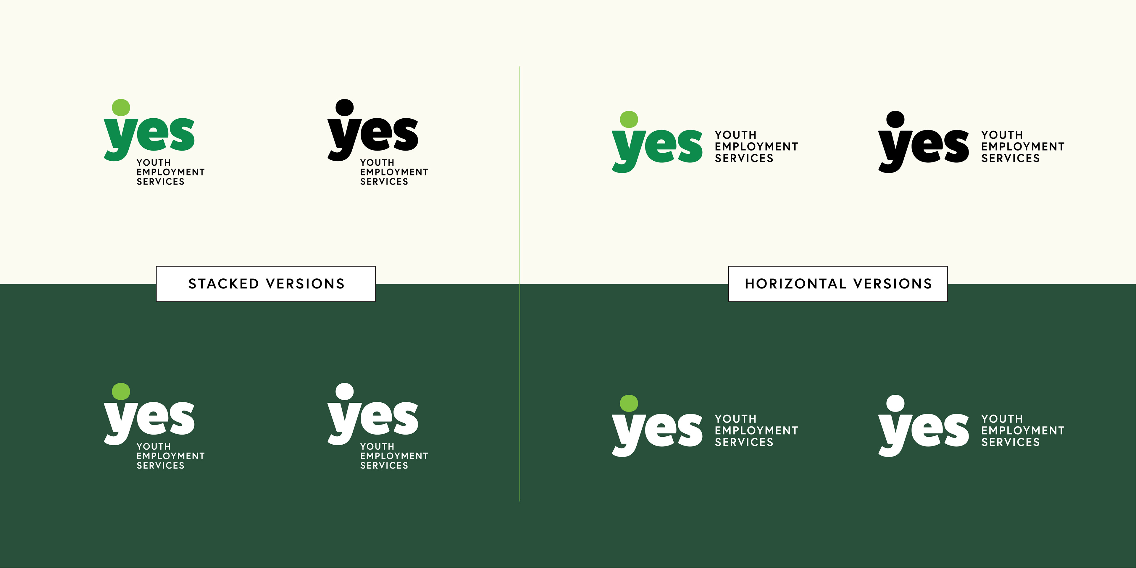
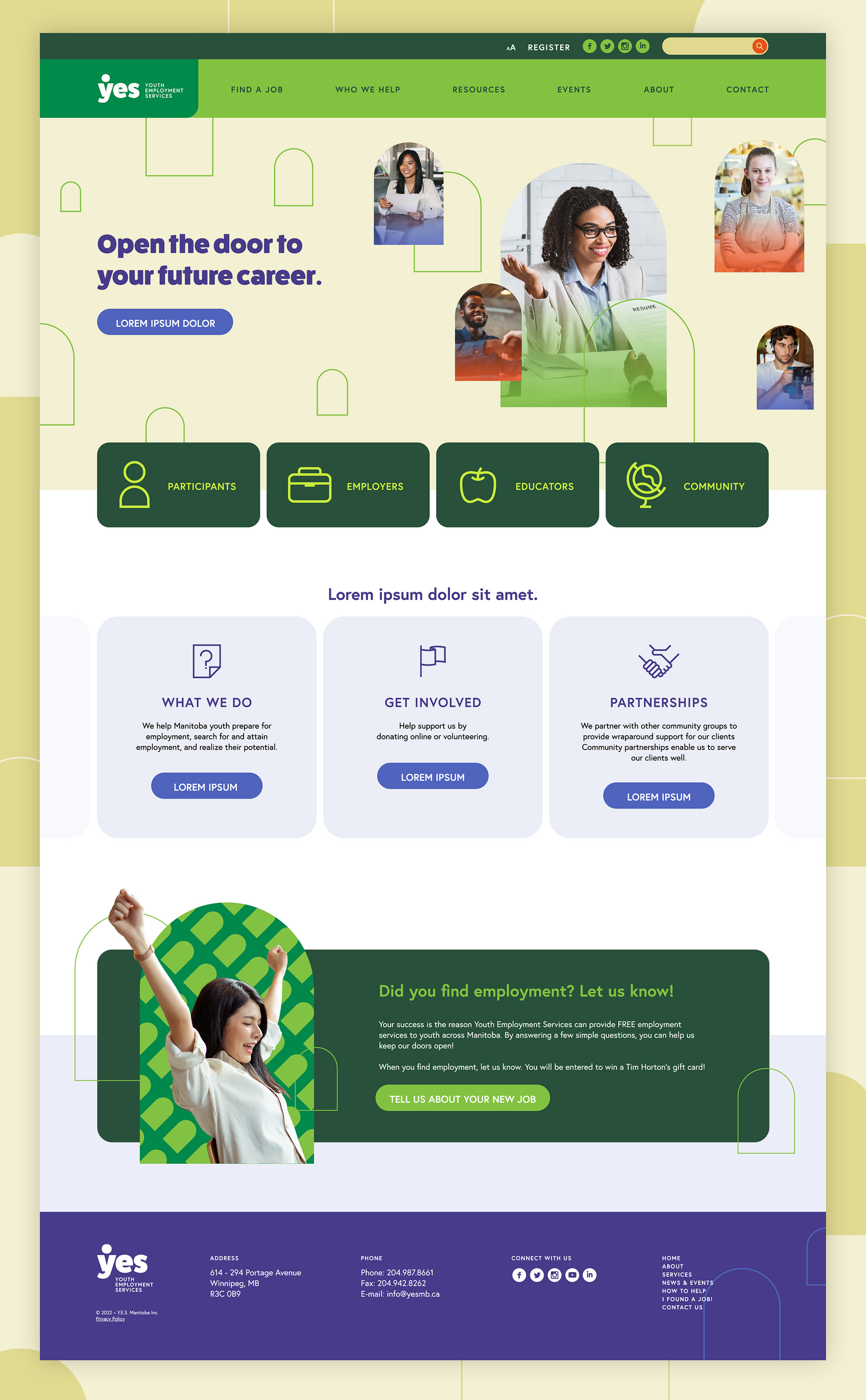
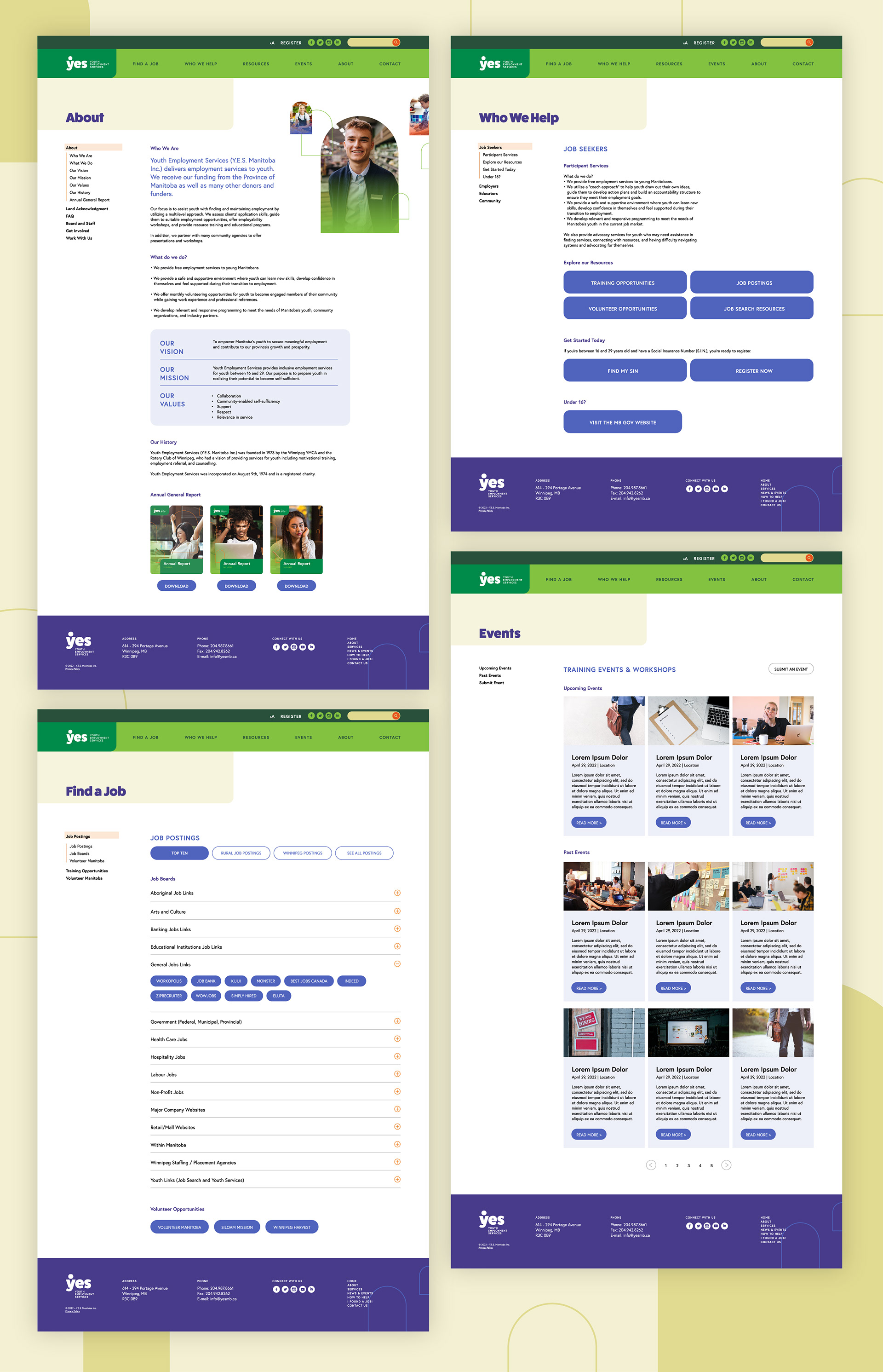
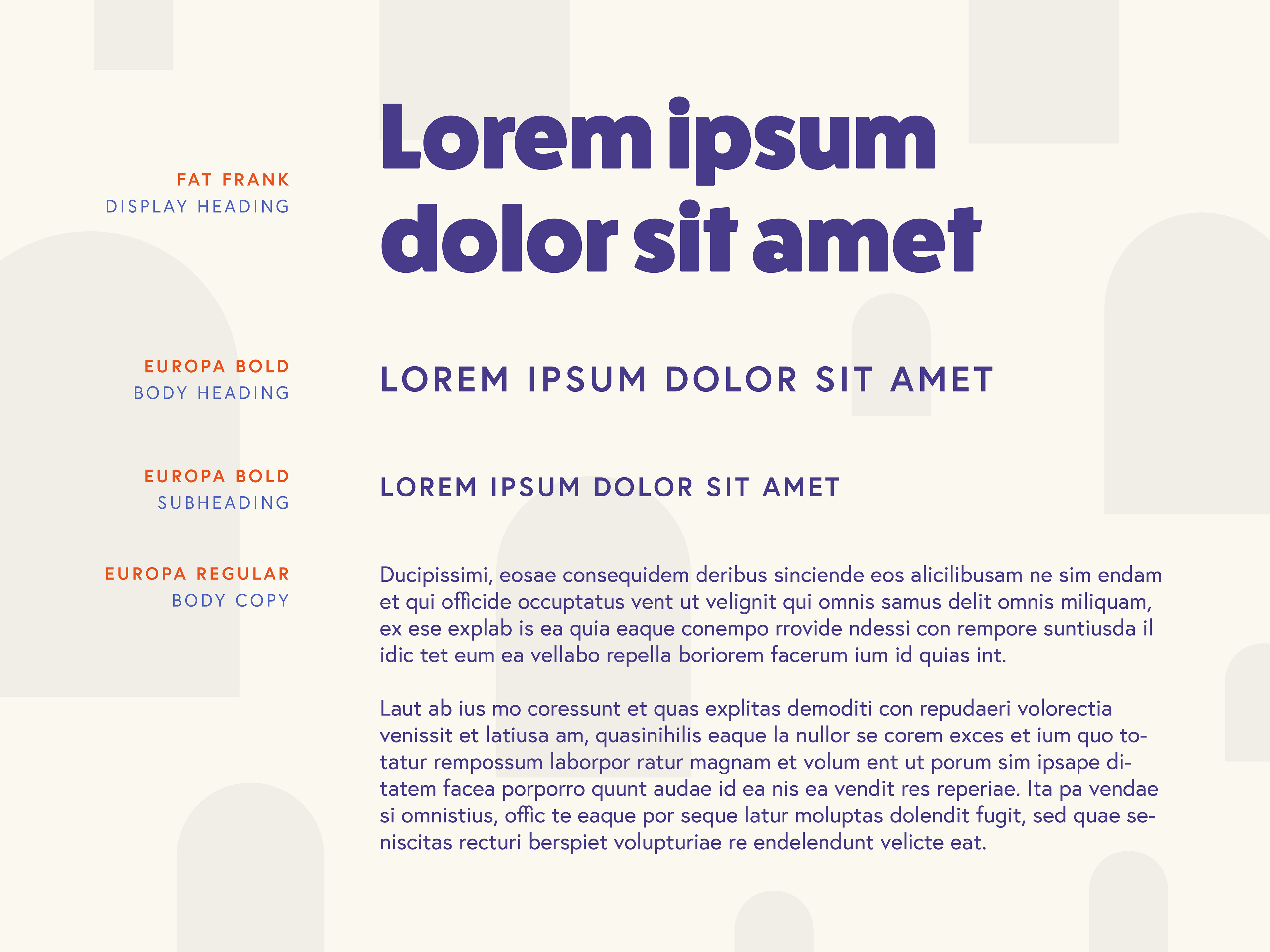
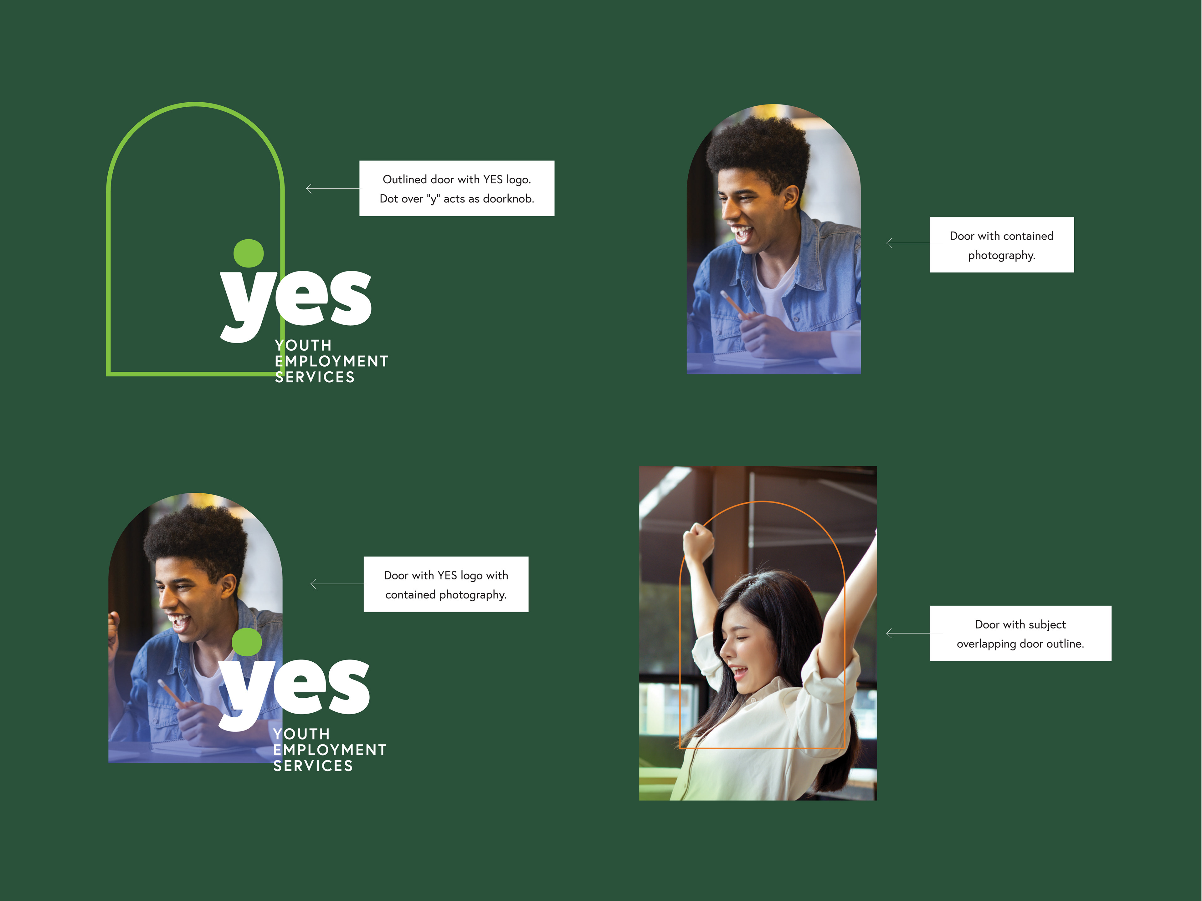
To help attract their primary audience, we developed a brand identity that uses a colour palette, typography, and elements that is bright, dynamic, and energetic, but not childish. The main visual motif of the brand is the "arched door" which is references the metaphoric "doors" that people open or go through their careers.


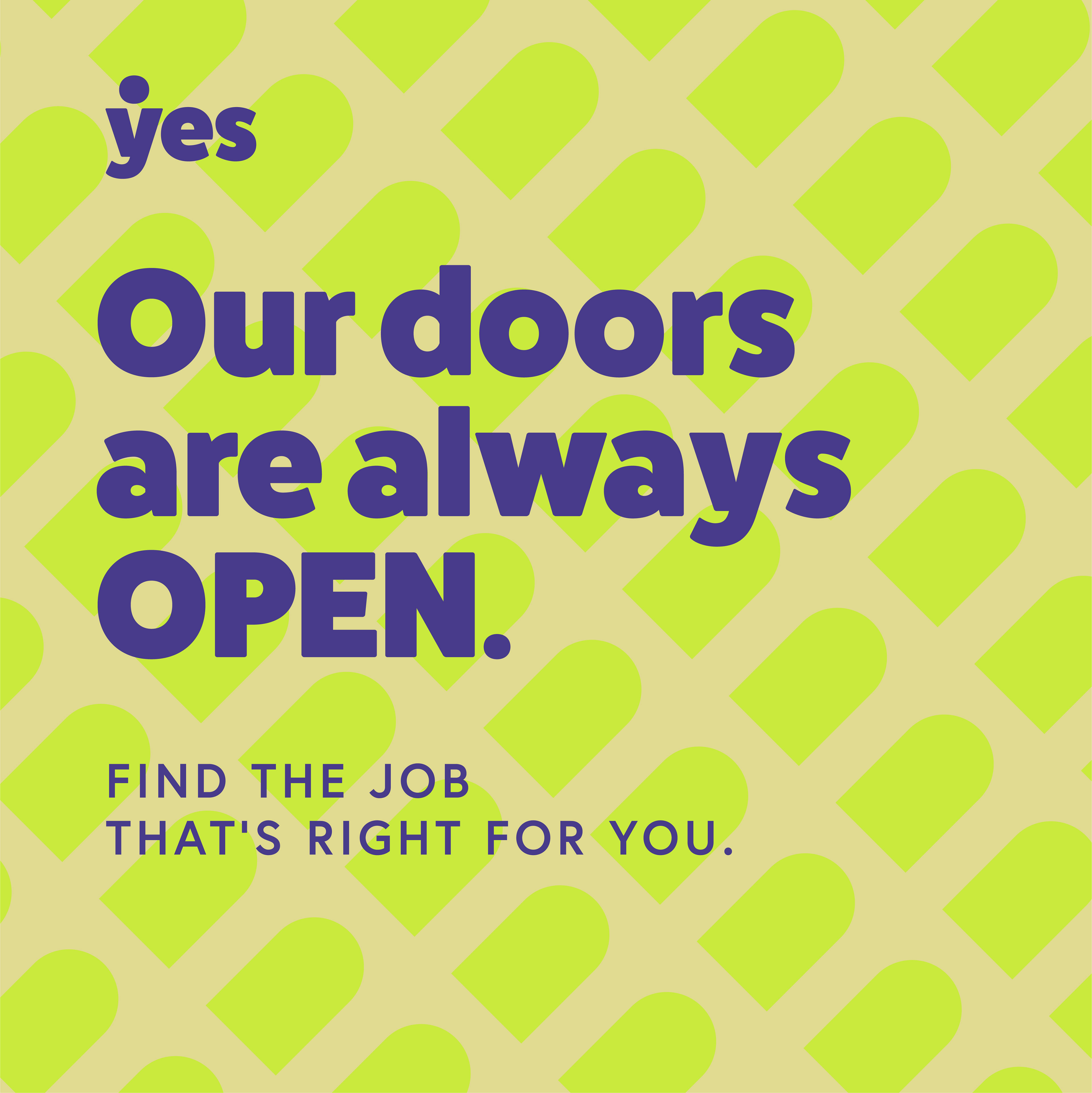


The project was capped off with the design of a website which was meant to be a commonly-referenced resource for young Manitobans in their efforts of finding meaningful employment.