The logomark for Shape Industries was featured in LogoLounge Book 14.
Made at Tétro.
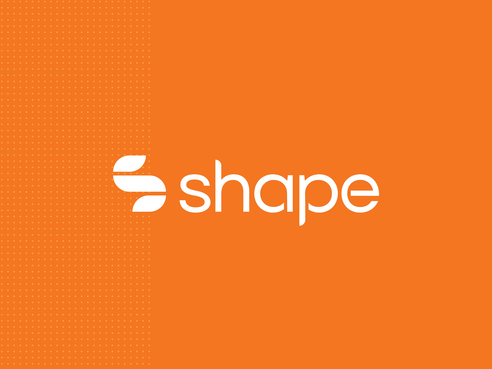

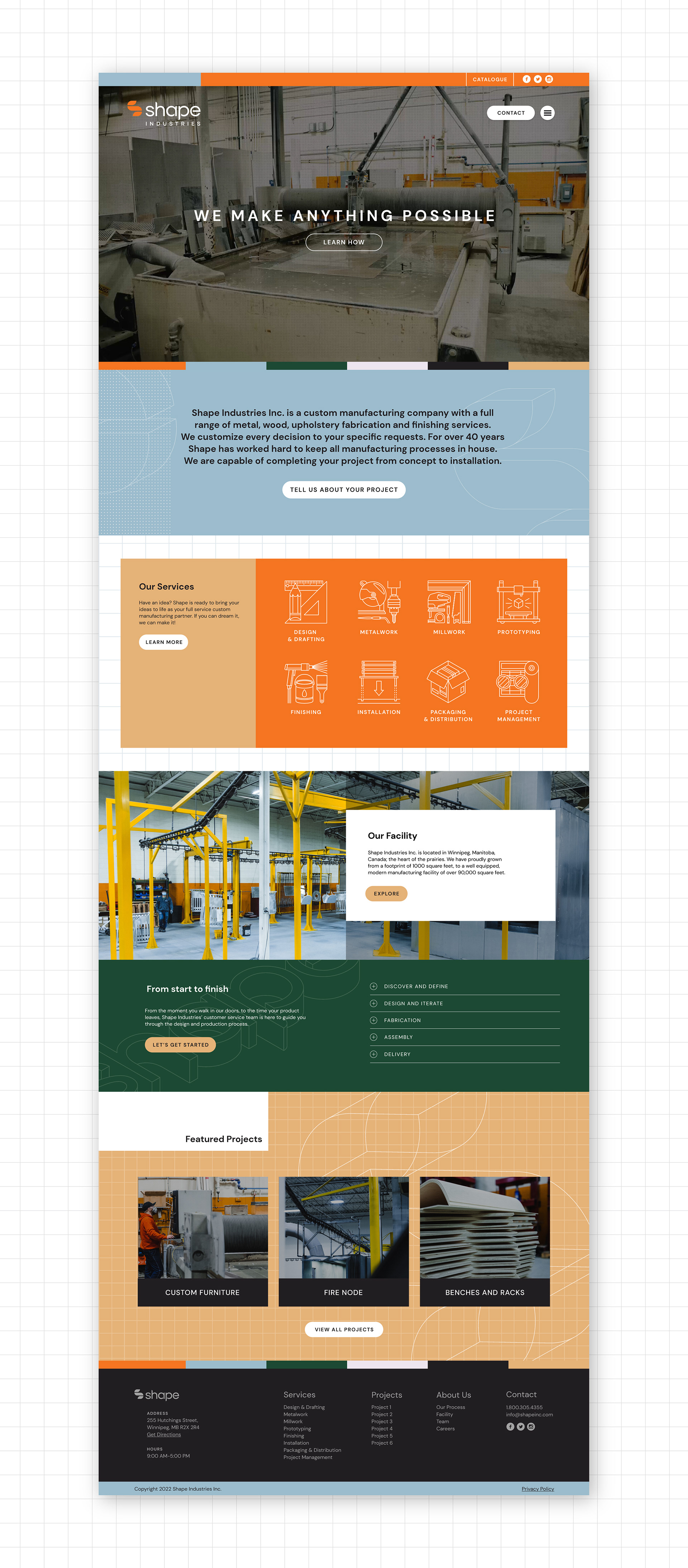
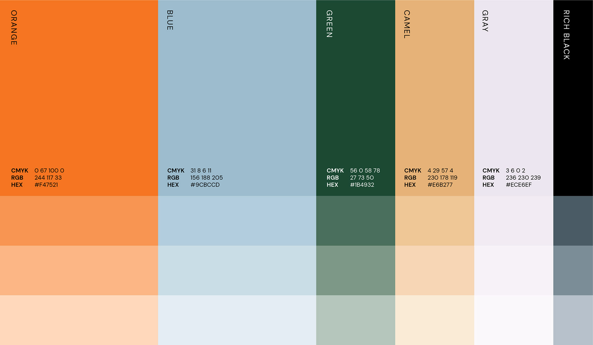
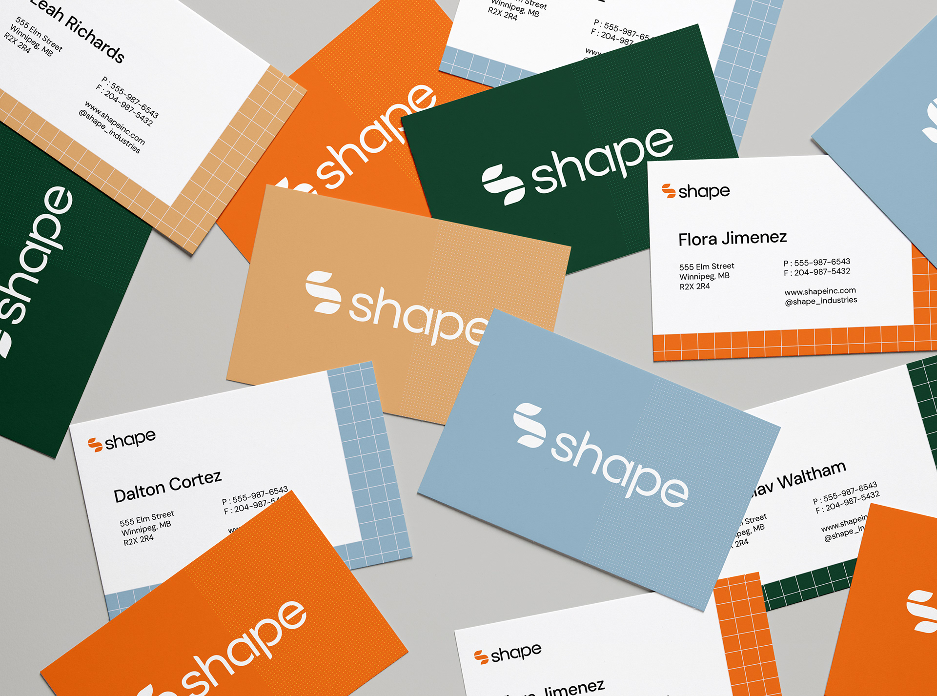
The brand elements were meant to embody a mechanical and architectural spirit. The colour palette is steely and evocative of engineering, construction, design, and manufacturing; and the primary typeface was selected for its geometric and approachable qualities.


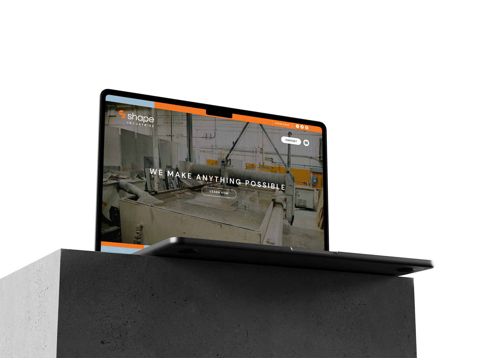

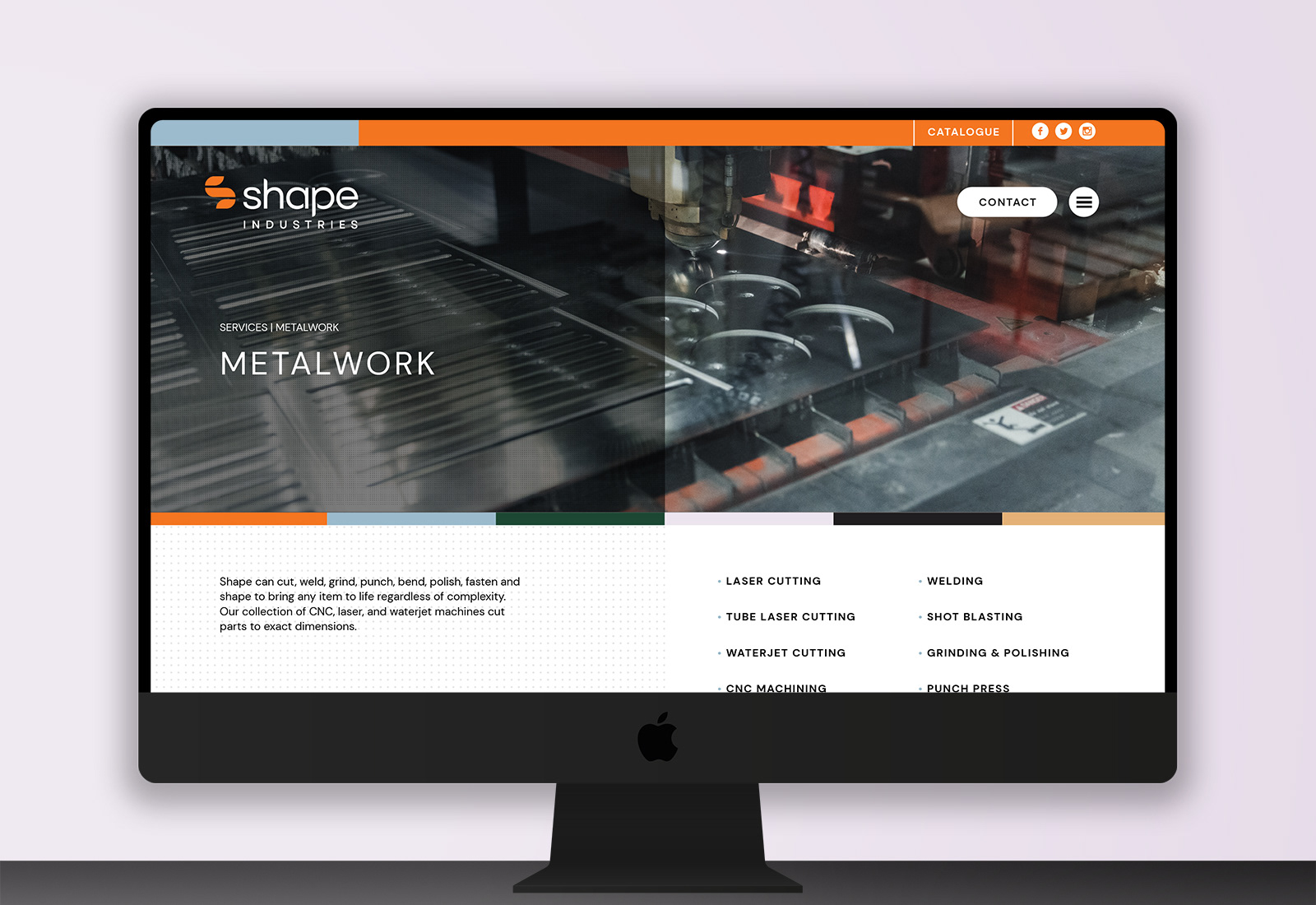
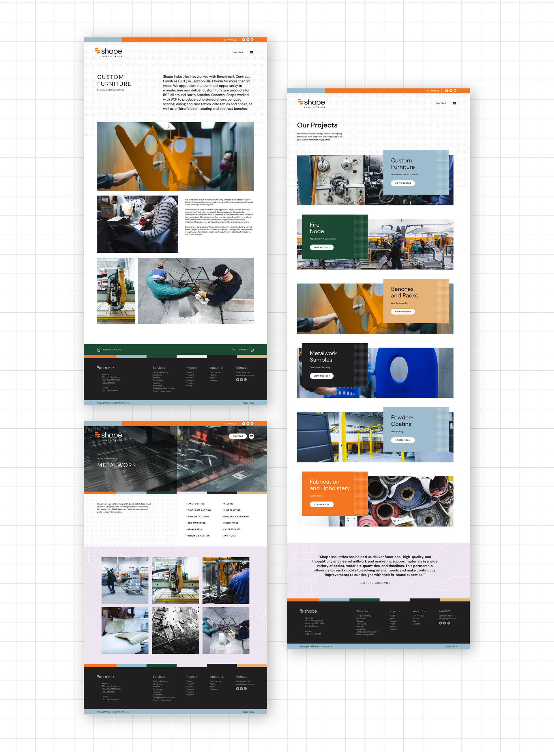
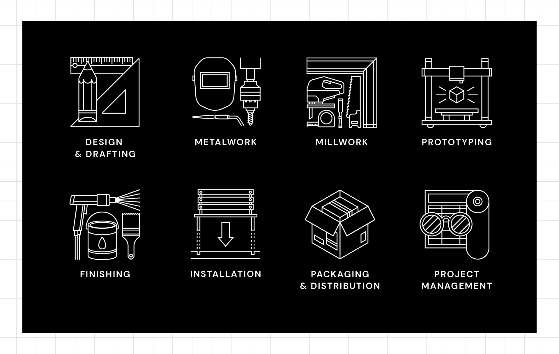
Shape Industries primarily wanted a website overhaul. The new Shape Industries brand identity was developed to form a foundation for the design choices for the website. The patterns, typography, and colour palette were all represented in this new website, and a set of icons specifically designed for this site were made to represent the various services Shape Industries offers.