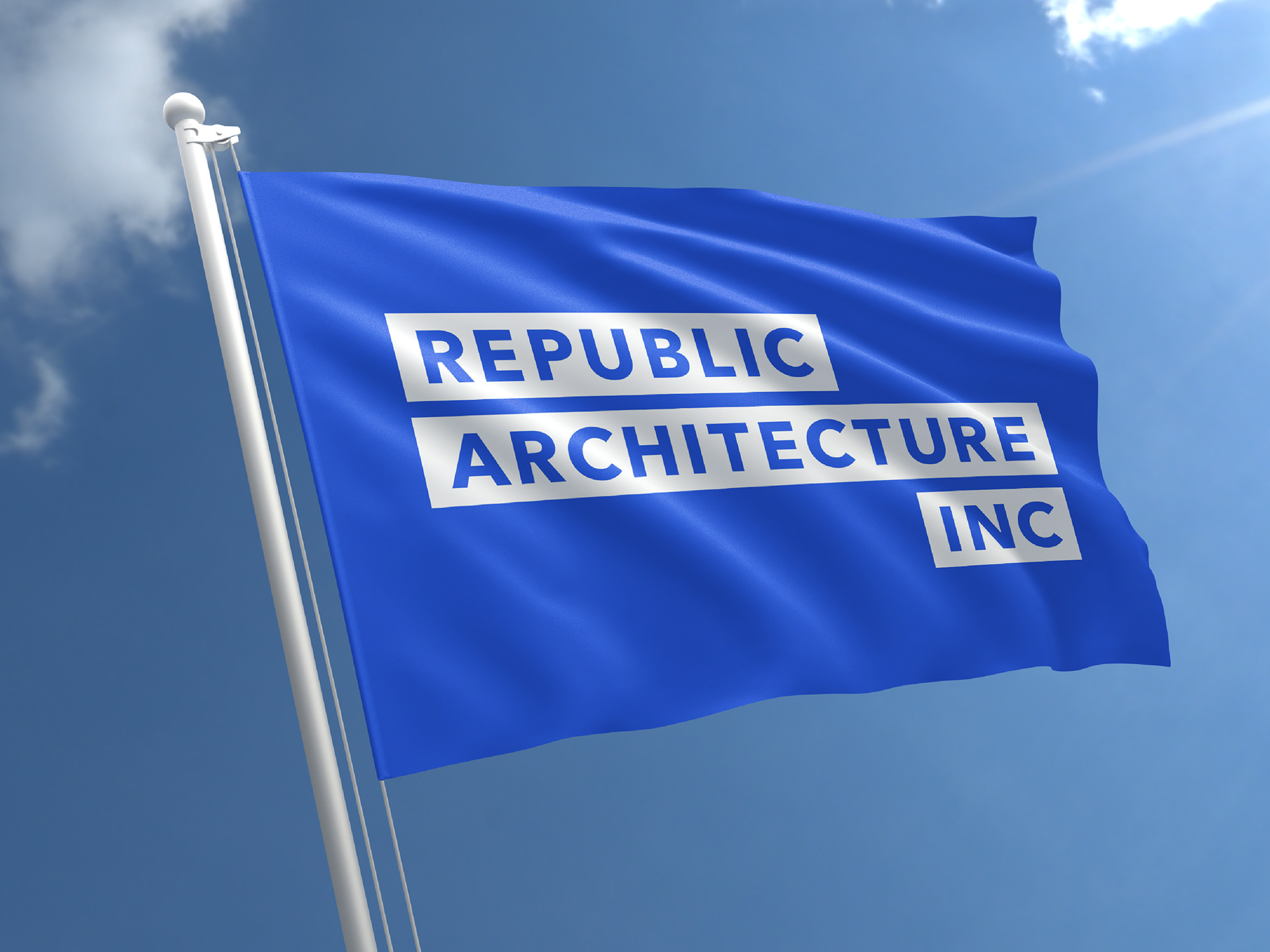
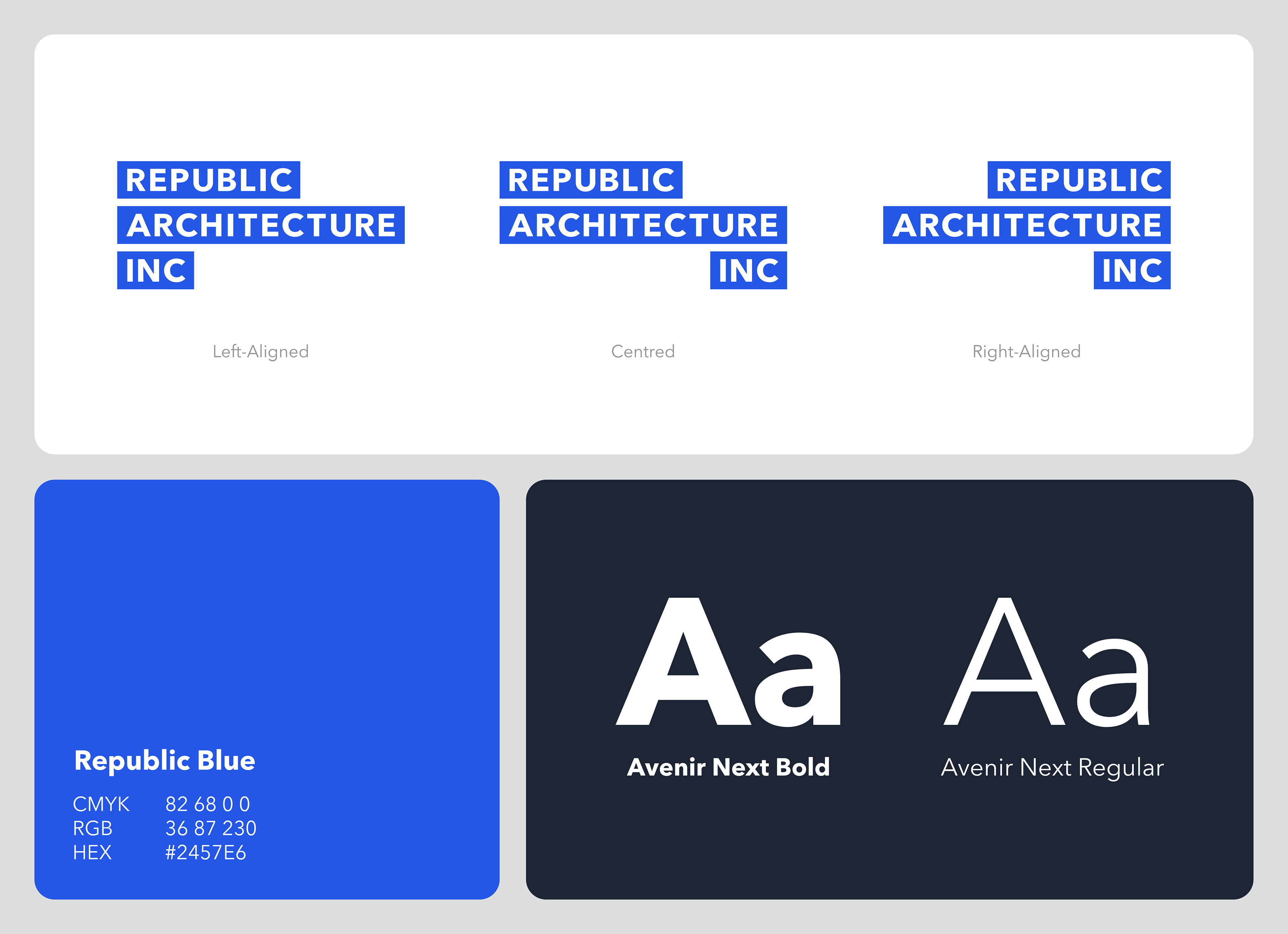
The logo is dynamic, and comes in three different alignments. The use of each one depends on its placement on the collateral, whether it is left-, right-, or centrally aligned. This was done as one of the firm's strongest values is in its philosophy of responding to all types of contexts. The colour choice was based on the firm's previous identity, but made more vibrant to develop a visual presence that was previously lacking.
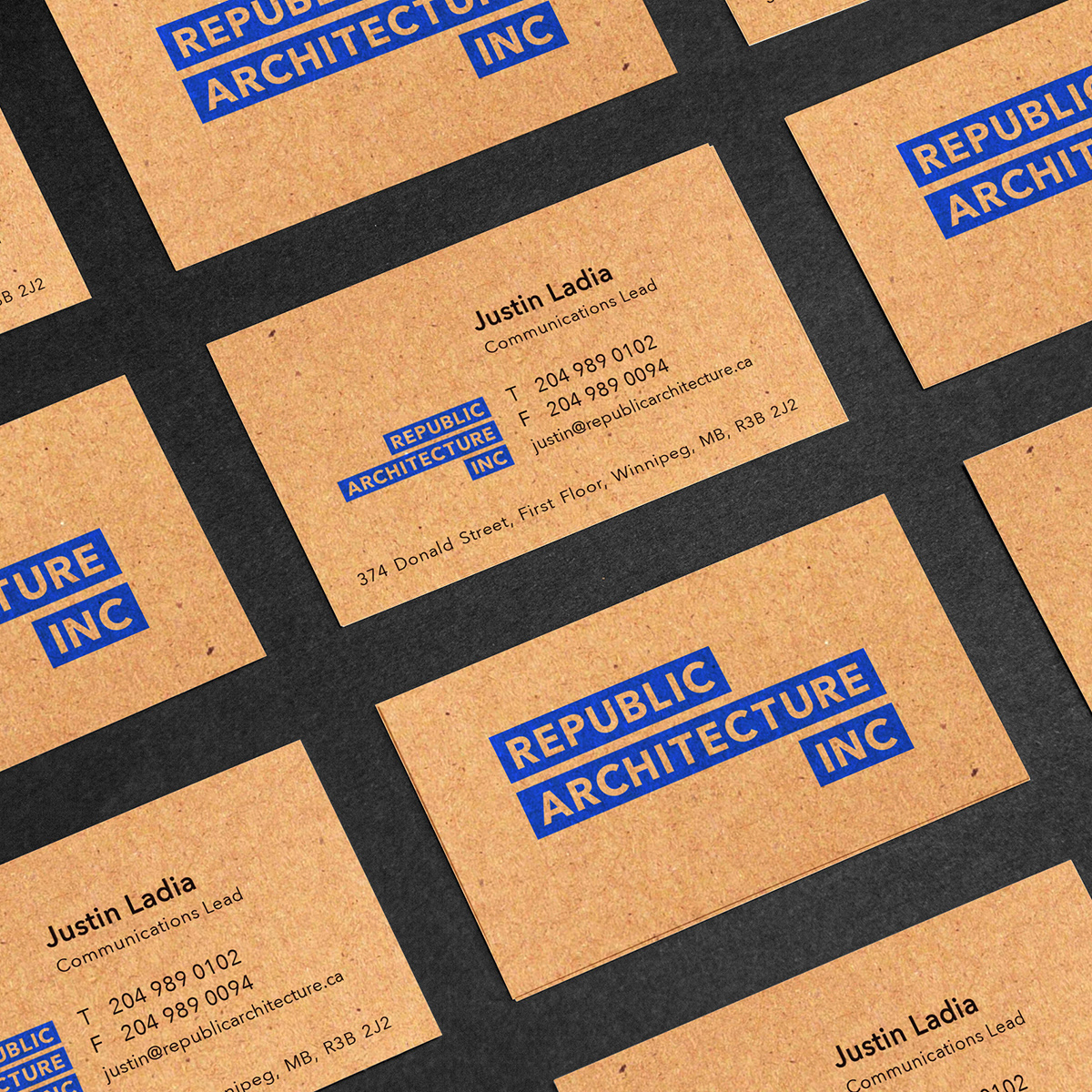
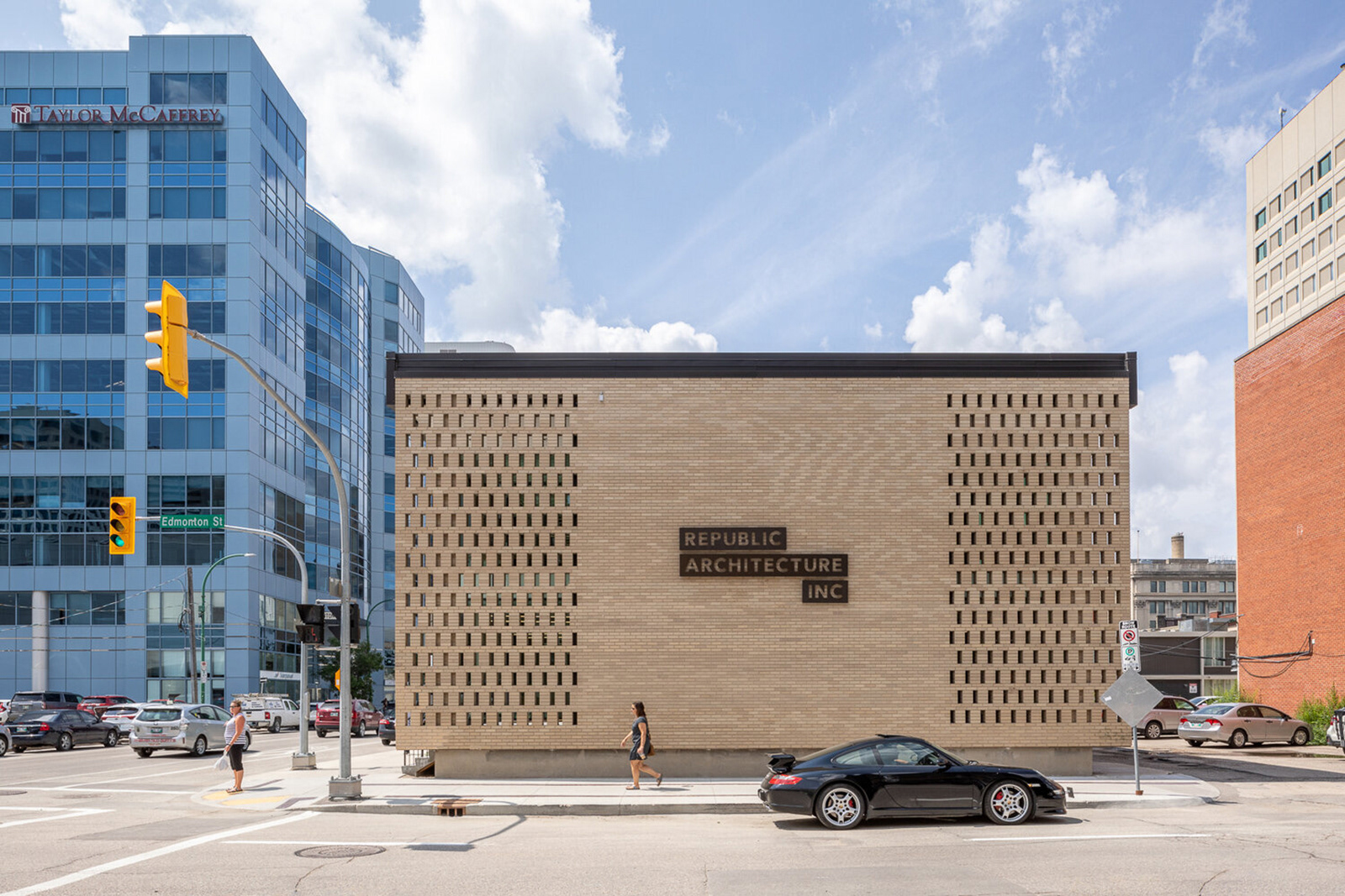
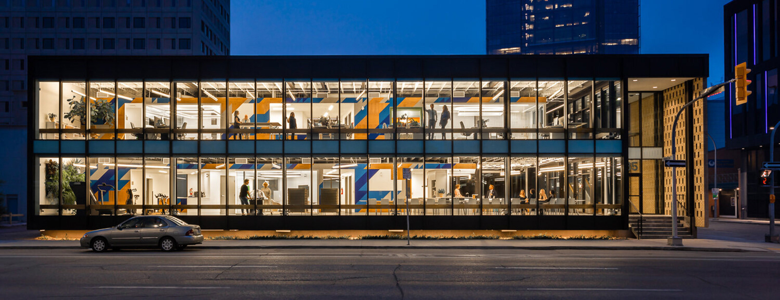
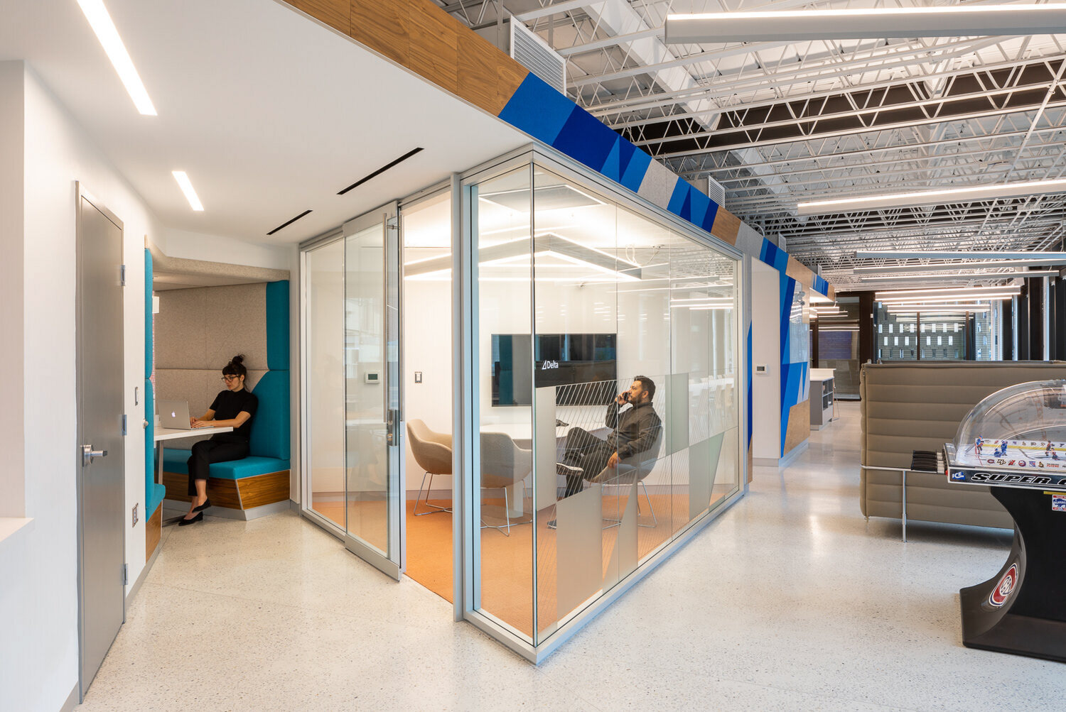
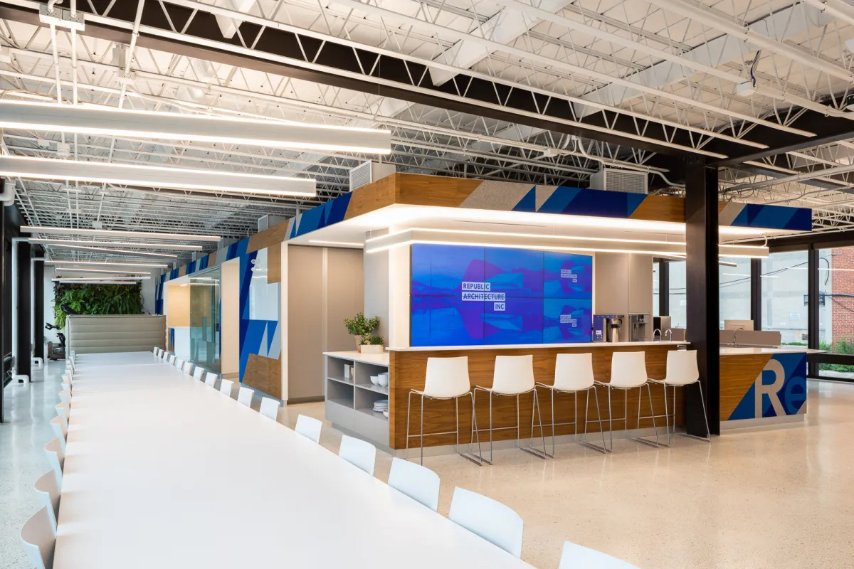
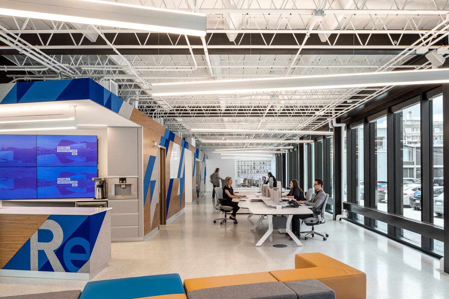
Collateral included business cards, letterheads, document templates, signage, and presentation material. A new responsive website was also developed for the firm as part of the project. Later, I would contribute supergraphics and signage using the rebrand in the design of the new Republic Architecture Inc. headquarters.
All of the following photos were taken by Jacqueline Young of Stationpoint Photographic.