Made at Tétro.
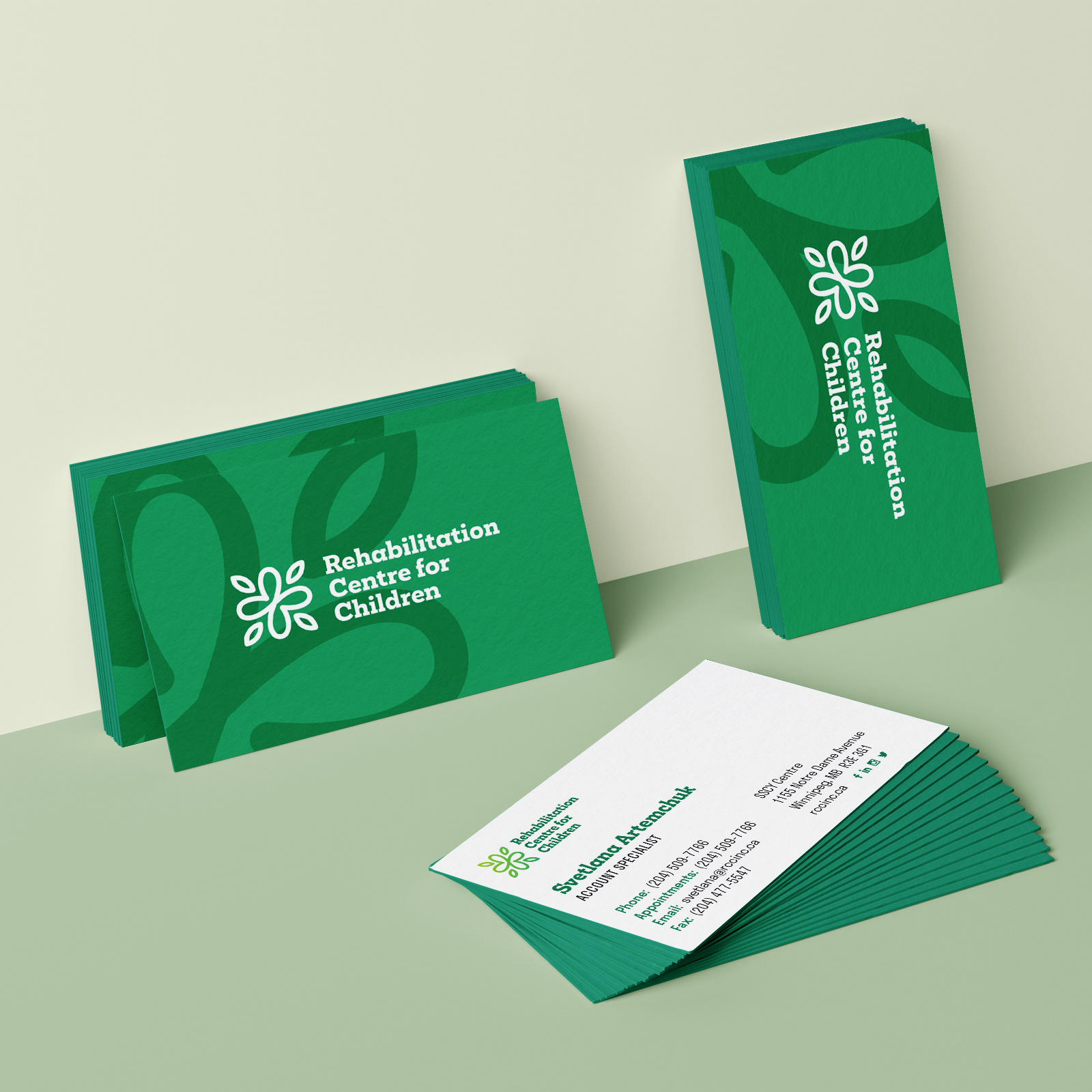
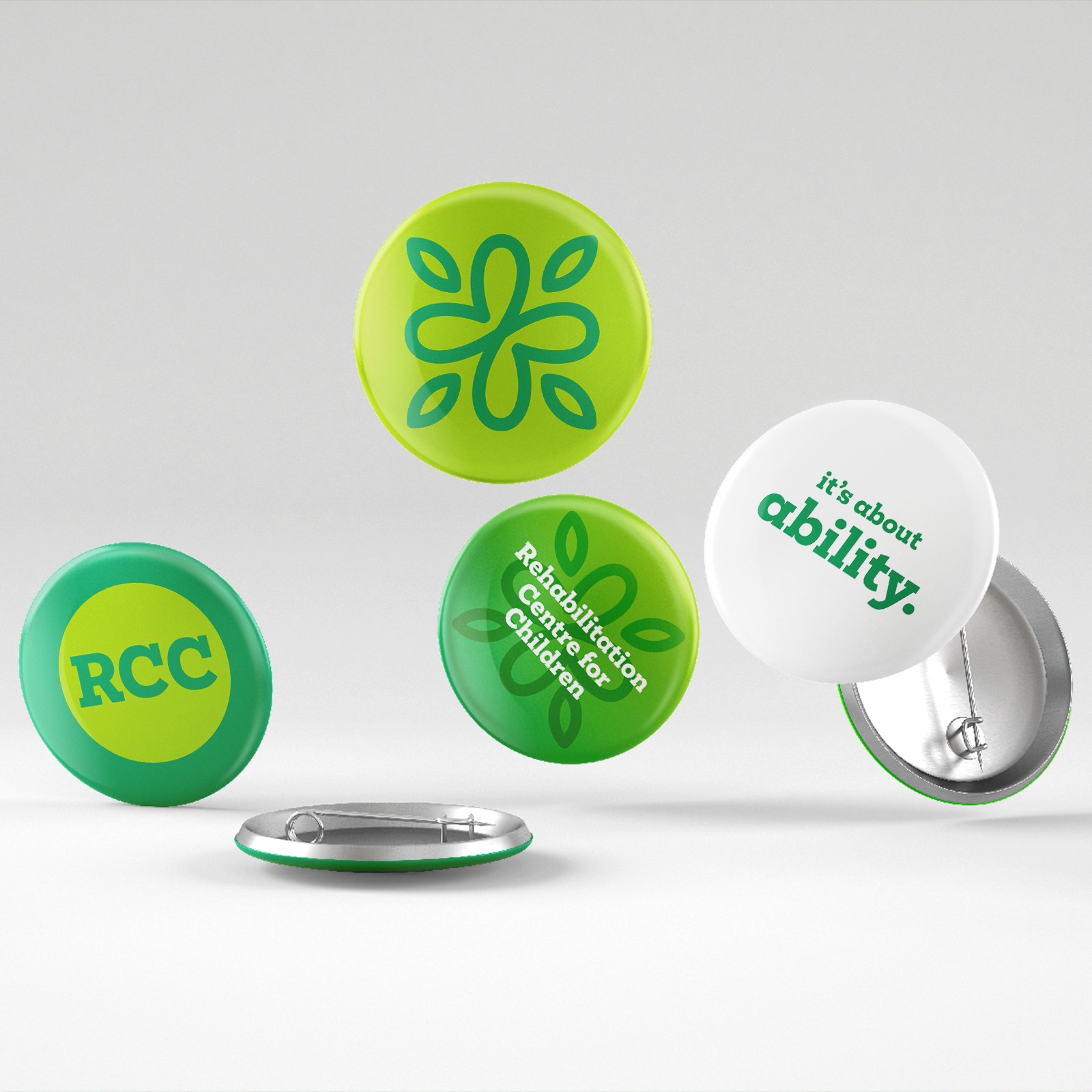
The logo's form (shared by both organizations) is an amalgam of a few simple visual metaphors: the cross for health, a heart for care, a flower for youth, and the infinity symbol for longevity.
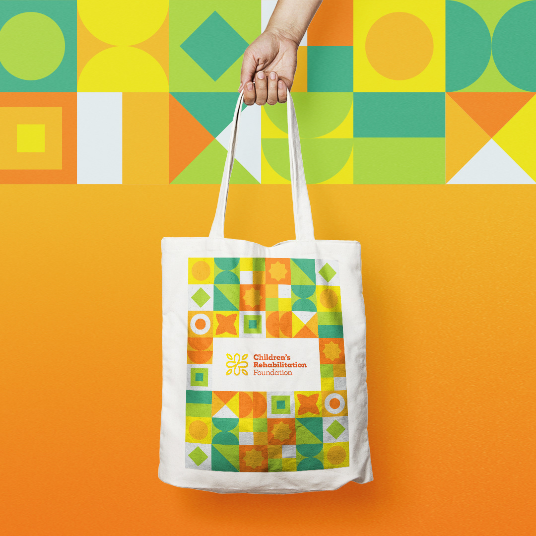
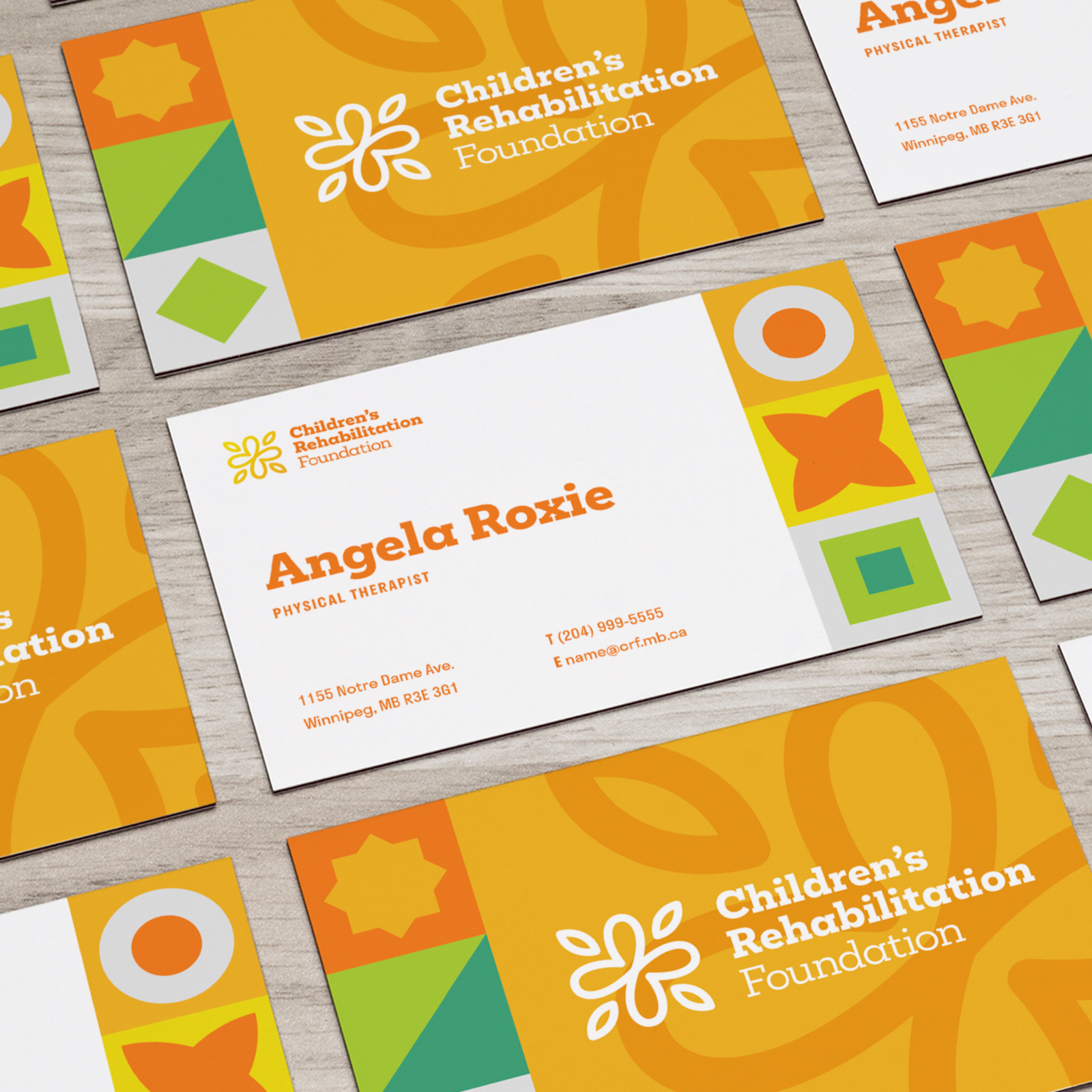
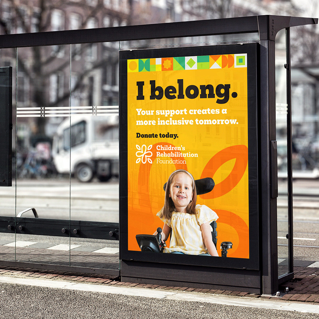
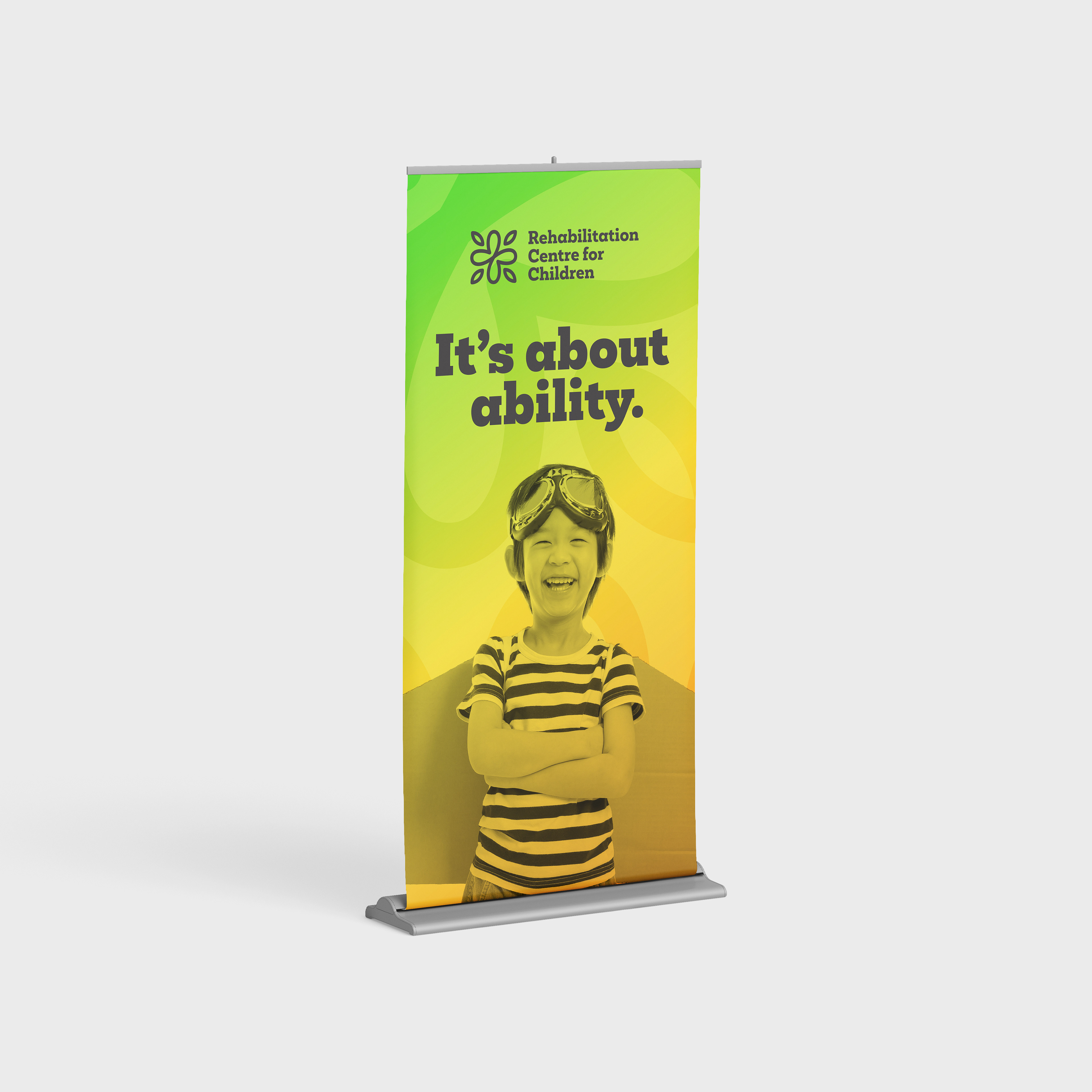
Overall, the colour palette is meant to be bright, youthful, and optimistic, and is shared by both organizations, but each one has its own primary colour. Both brands make use of gradients and a geometric pattern that contains all of the colours of the brand palette.
The brand identity is dynamic and energetic and it resulted in a series of brand activations and assets that embodies the spirit of the two organizations' work and client base. We developed print assets, merchandise, social media assets, and campaign advertising material during the course of this project.


The Rehabilitation Centre for Children and Children's Rehabilitation Foundation brand projects included the development of two separate websites. The design of these websites paid particular attention to accessibility while also developing a dynamic user experience.
