Made at Tétro.

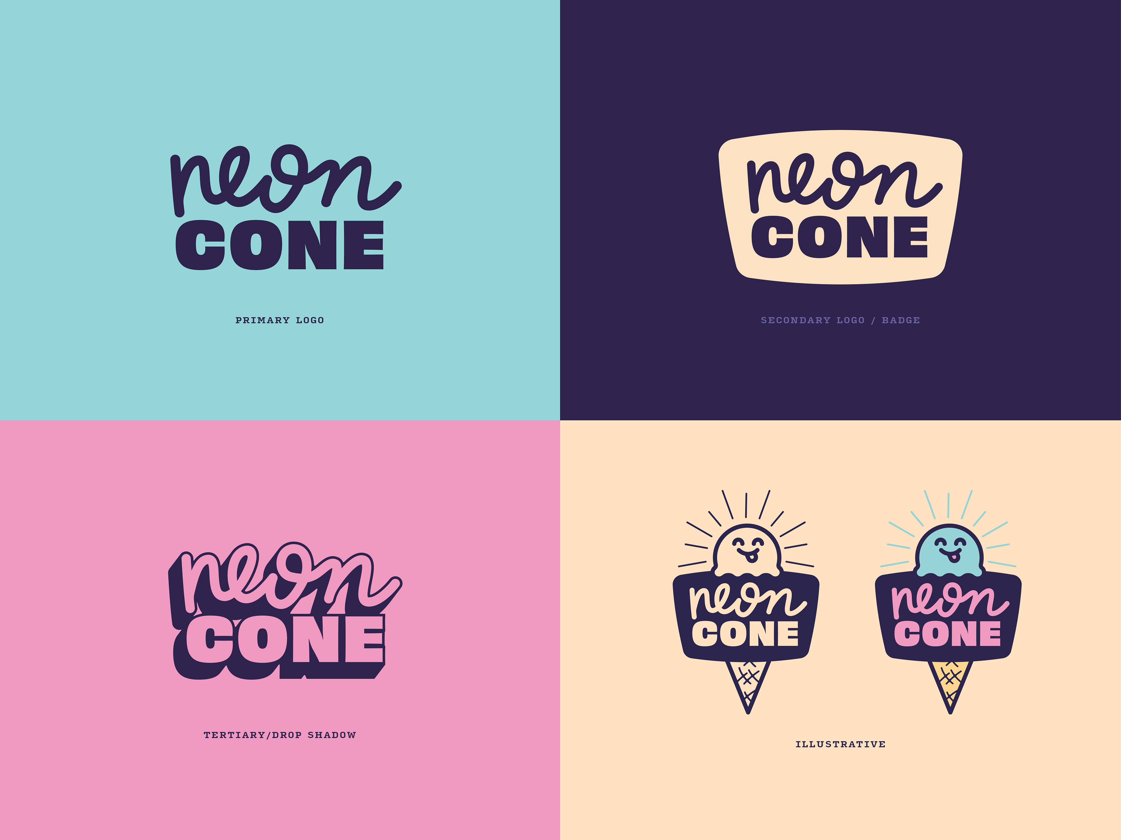
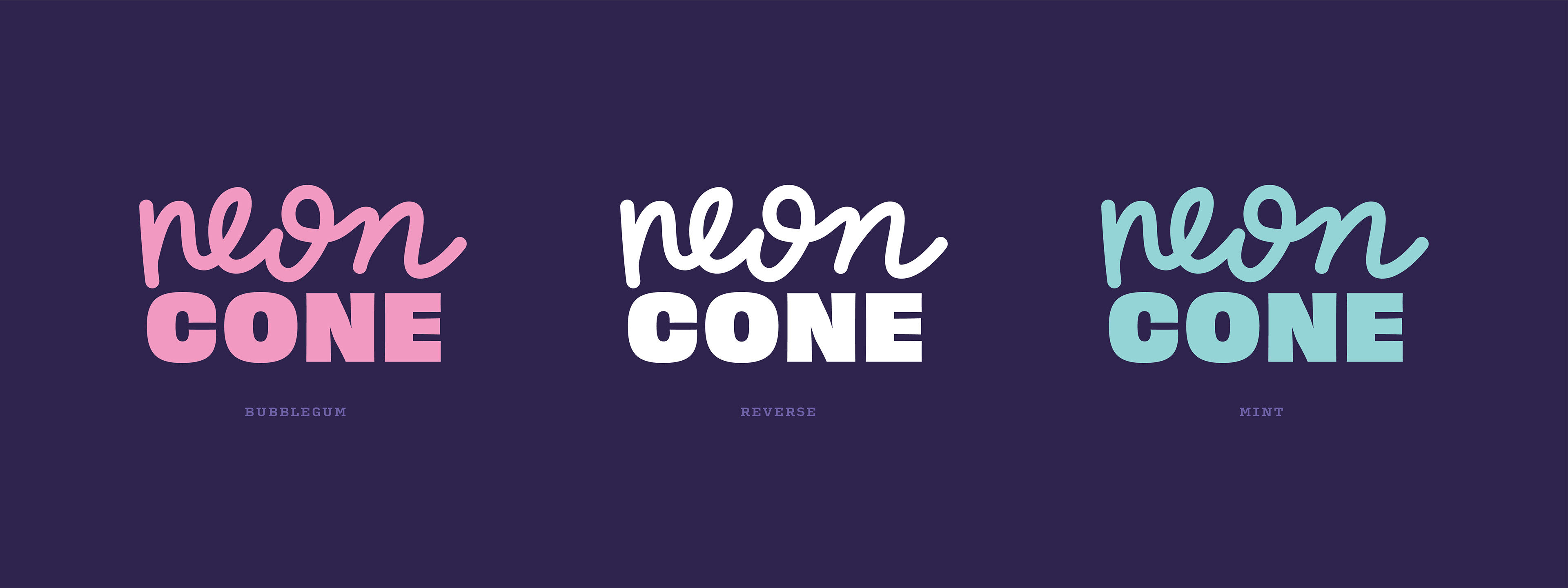
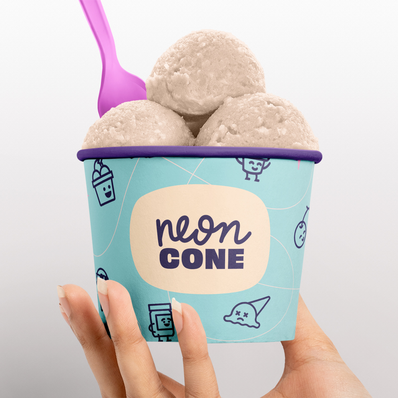
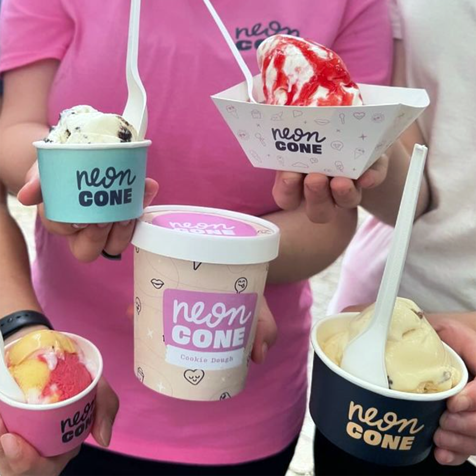
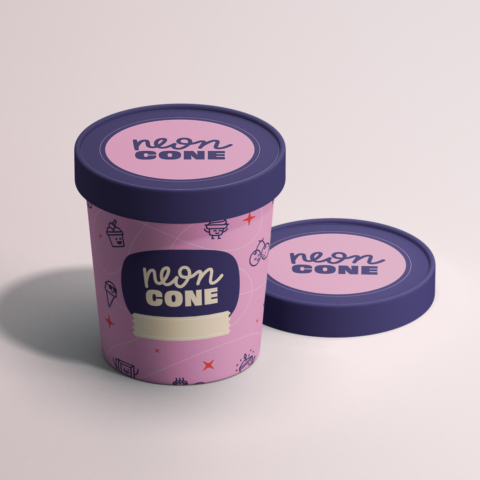
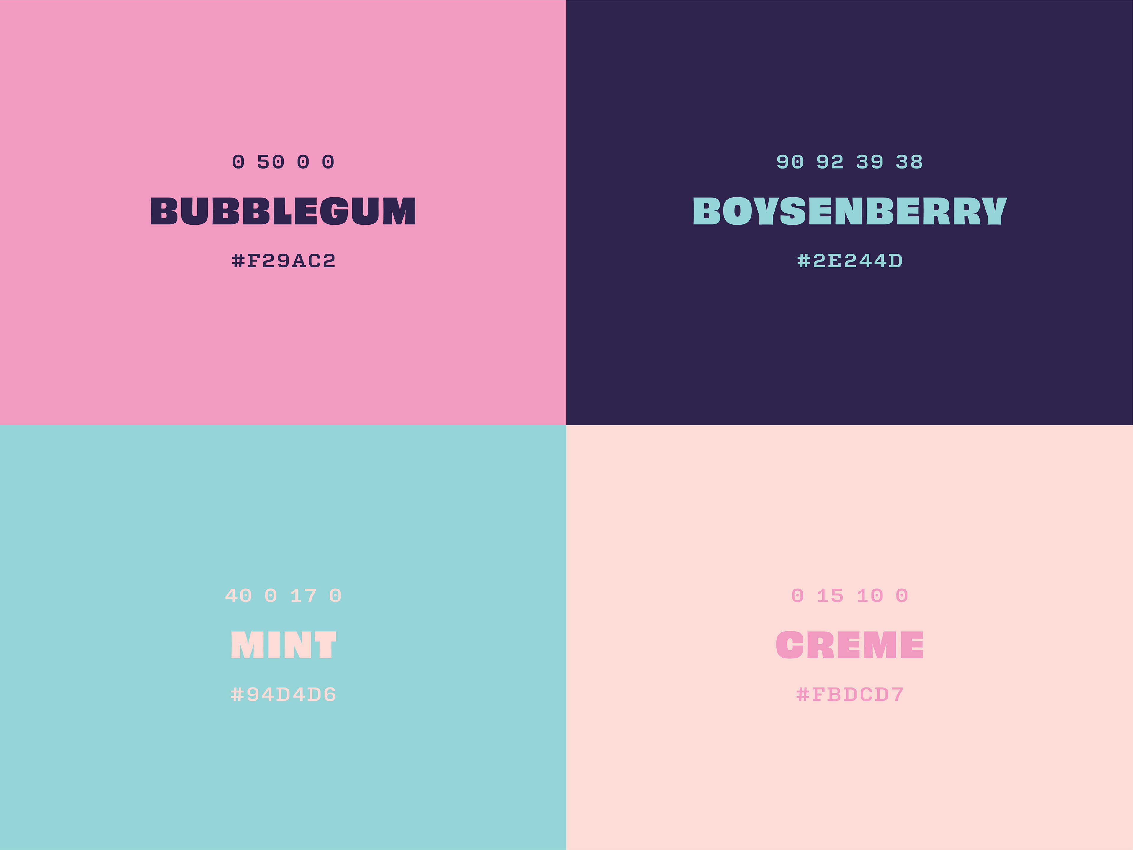
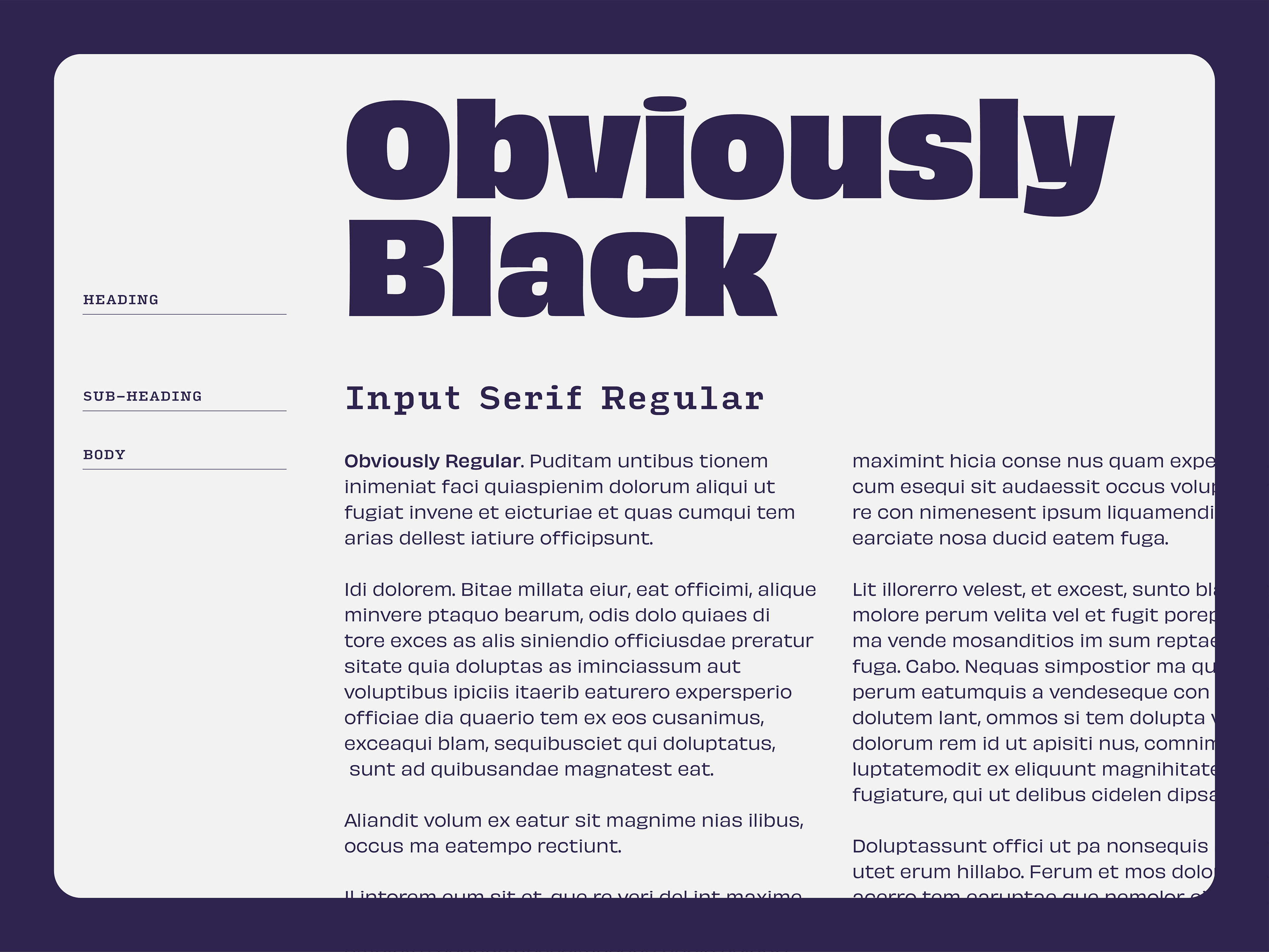
The overall brand identity for the Neon Cone was meant to be playful and appropriate for all ages. The colour palette was designed to include sweet, creamy pastels, contrasted by a rich, dark hue. The intent for this brand was to be bold and expressive yet approachable and tasteful.
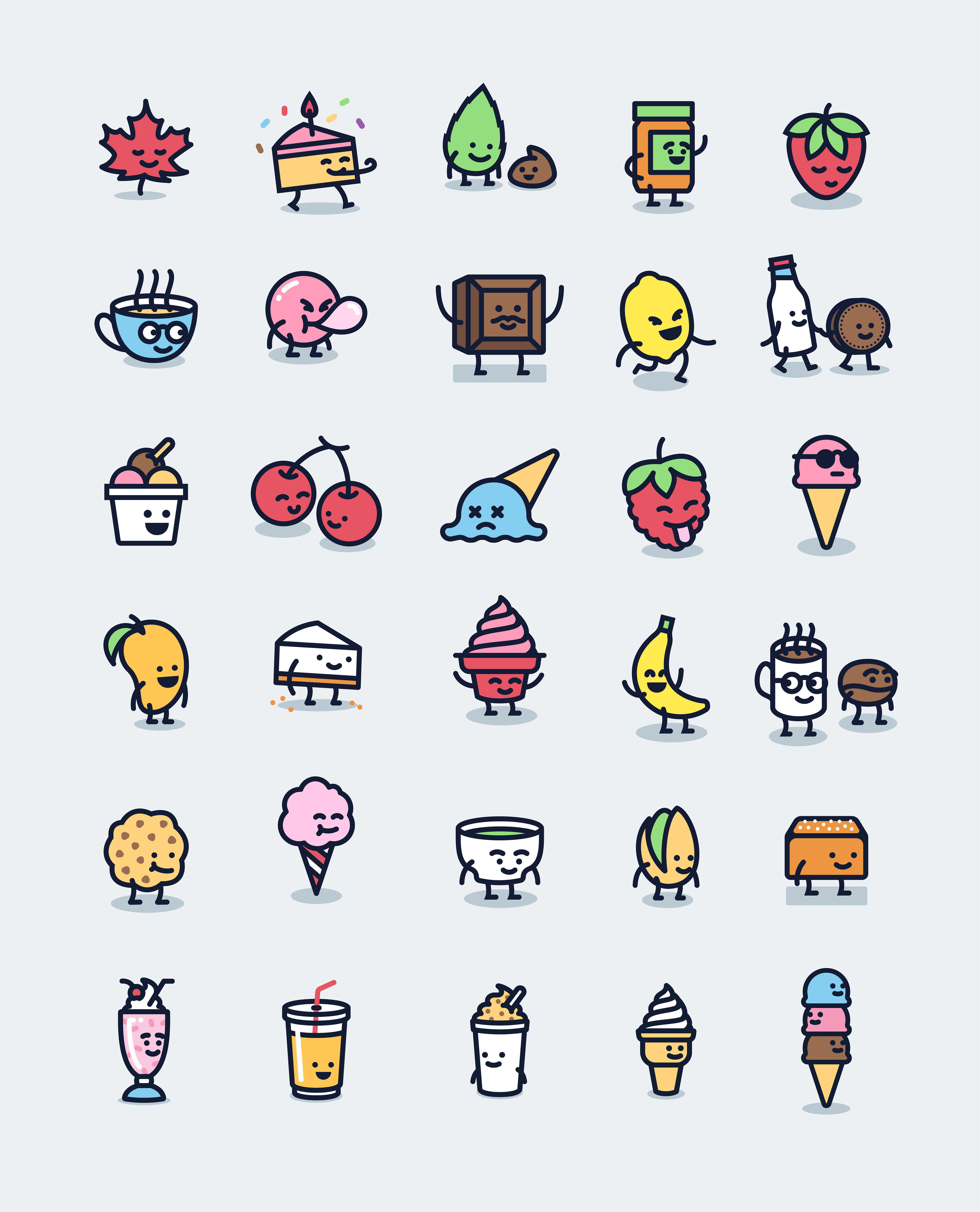

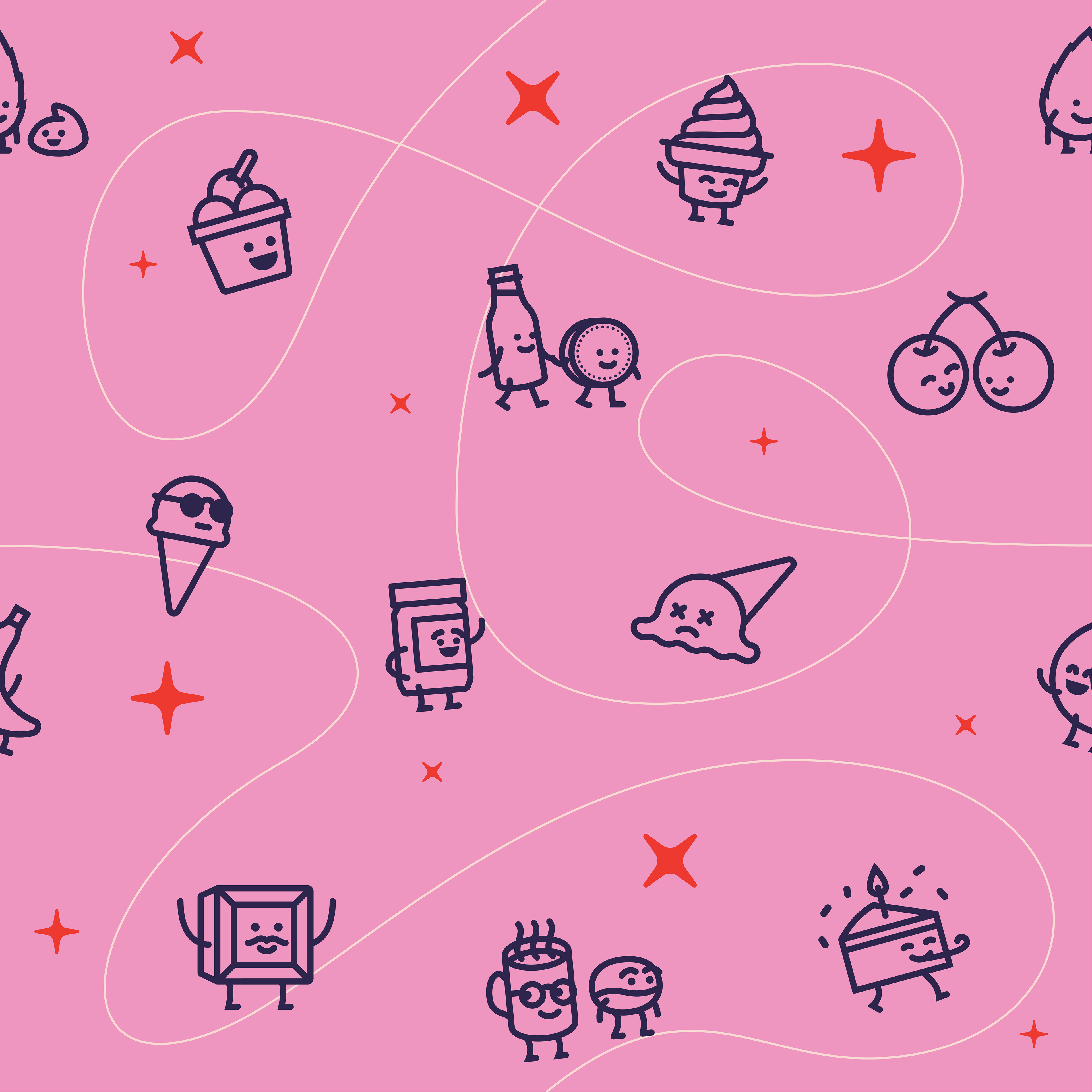
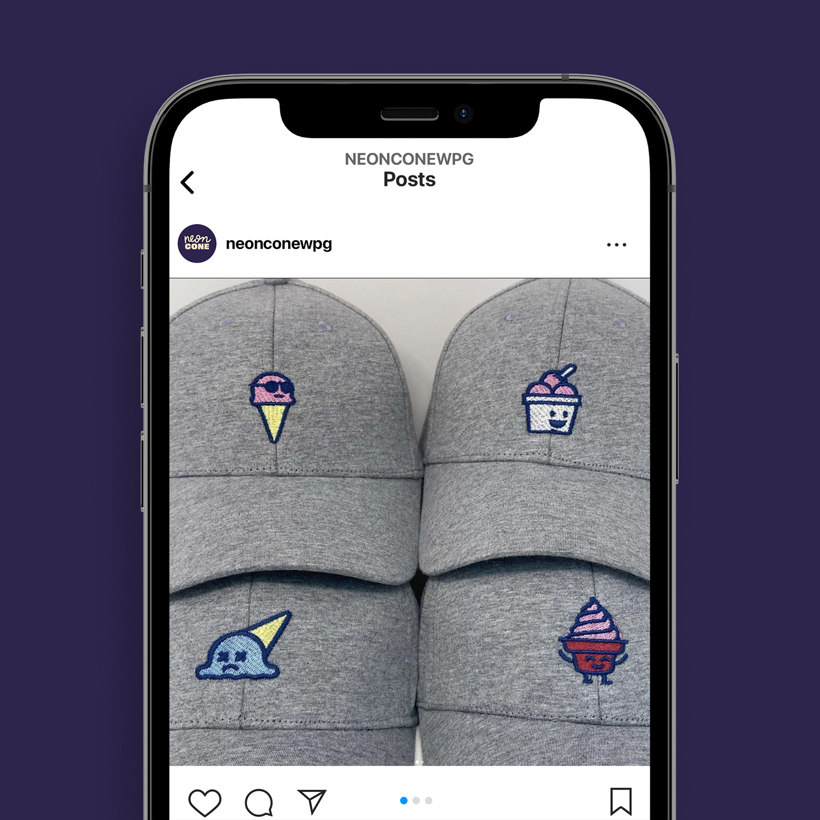
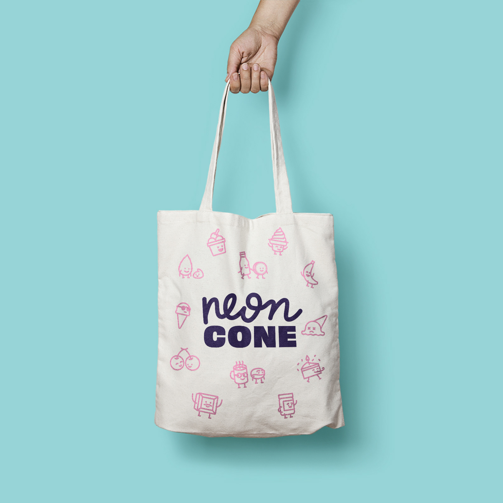
Characters were made for the various flavours they make at the Neon Cone and to represent some of the products they serve at the store. These were translated into flavour stickers, embroidered onto caps the staff wear, and can be seen in almost every application in the new Neon Cone brand.